RACI vs RASCI: a Comprehensive Overview
RACI and RASCI charts are useful tools for defining roles and responsibilities in projects. This article will provide a quick overview of RACI matrices before comparing the key differences between RACI vs RASCI models. We’ll cover the purpose and applications of each chart to help determine when one may be preferable over the other.
What is a RACI chart?
A RACI chart is a useful visualization tool for mapping out roles and responsibilities on a project. It is used to visualizes:
- Who is doing what
- Who has the final say
- Who needs to provide feedback
- Who needs updates
The main benefit is that it clarifies expectations and prevents confusion around project team members’ roles. Using a RACI matrix upfront enables smooth collaboration and collective ownership. With clear responsibilities, a project has a greater chance of success.
RACI matrix role definitions
RACI stands for Responsible, Accountable, Consulted, and Informed.
Let me briefly explain each role:
- Responsible – This person is responsible for getting the work done. They ensure the project task or deliverable is completed properly and on time.
- Accountable – This person has ultimate ownership, makes final decisions and oversees the work. They approve the work and are held accountable for the outcome. In the context of project management, this is typically the project manager.
- Consulted – These people provide subject matter expertise to guide the Responsible person. Their input and advice is crucial.
- Informed – These individuals are kept updated on progress and outcomes but do not actively participate.
In summary, the Responsible party does the work, the Accountable party approves the work, the Consulted party provides guidance, and the Informed party receives updates.
RACI chart example
Let’s look at a simplified example RACI chart for a project to launch a new website. The project involves a number of different actors.
For the task of conducting user research, the UX team is Responsible, the marketing manager is Consulted and the dev team is Informed. This means the UX team oversees user interviews, while also getting inputs from marketing and keeping the devs up to date.
But for building the website, the dev team is actually Responsible and, for example, the CTO can be considered Accountable, as the dev team does the work, but the final sign-off comes directly from the CTO.
Mapping out the RACI chart in this way ensures all parties understand their role for each task. It prevents duplication of work or reliance on assumptions.
When Should You Use a RACI Matrix?
A RACI matrix is an incredibly helpful tool for any project where responsibilities need to be clearly defined.
Typically, a RACI chart is most useful for cross-functional projects involving multiple teams or departments. For example, launching a new product requires coordination across technology, marketing, sales, and customer support.
Rather than assuming everybody understands their role, a RACI matrix explicitly maps out who is Responsible, Accountable, Consulted, and Informed for each task.
Additionally, RACI charts are helpful when bringing on a new team member or if there are changes in resource allocation mid-project. The chart allows new folks to quickly see expectations.
Throughout a project, referring back to the RACI matrix enables frictionless collaboration. If questions arise around roles, the chart provides clarity. This supports leadership in driving accountability and alignment.
RACI vs RASCI
RACI and RASCI matrices are similar responsibility mapping tools with a key difference in the “S” for Support role.
The Responsible, Accountable, Consulted and Informed roles are defined the same in both models. However, RASCI adds the Support role, referring to those who provide hands-on assistance and resources to enable the Responsible party to complete tasks.
It is important not to confuse Support with Consulted. The Consulted role provides input and guidance but does not directly help do the work. The Support role actively supports accomplishing the tasks.
The benefit of RASCI over RACI is it distinguishes between those doing the work (Responsible) and supporting the work (Support). This adds granularity and provides greater role clarity.
RASCI is best for complex projects where the Responsible party needs assistance from additional teams or resources to perform tasks successfully.
RACI vs RASCI: Other Differences
By adding more nuance with its extra “Support” role, RASCI differs from the traditional RACI approach in the following ways:
- Complexity – Being more detailed, RASCI is slightly more complex, but provides greater clarity and role granularity.
- Collaboration – RASCI promotes collaboration by enabling actors who would otherwise be excluded by certain activities just because they are not directly responsible for them.
- Engagement – By calling certain actors out as Supporters, they will naturally feel more engaged in the project as well.
- Visualization – By introducing one additional role, the RASCI chart is also slightly different visually with an extra column.
How to create a RACI / RASCI matrix
Most project management tools give you the possibility to create both a RACI or RASCI matrix. On the other hand, creating such a matrix can be easily done also in Excel, Word or PowerPoint without significant efforts. After all, you just need to build a table.
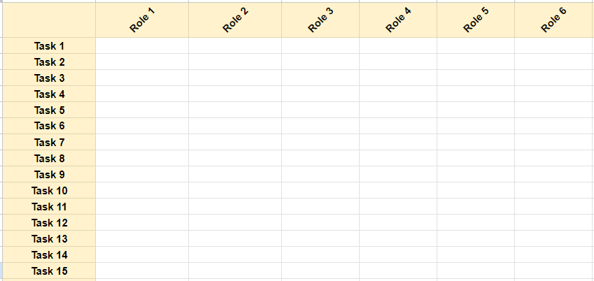
First, list all the tasks or deliverables in the rows.

Then add all the team members or roles across the columns. Leave the top left corner blank.

Finally use the initials and color coding to map roles, for example you can highlight:
- R for “Responsible” in green fill
- A for “Accountable” in orange fill
- C for “Consulted” in blue fill
- I for “Informed” in gray fill

You can also spell out RACI across the top. The result is a clear visual matrix mapping roles for each task.
RACI vs RASCI: Pros and Cons
These two charts offer valuable visualizations of responsibilities, with trade-offs to consider:
RACI
- Pros: Simple, clean, easy to understand roles.
- Cons: Lacks nuance for complex projects, confusion can exist between task doers and supporters.
RASCI
- Pros: Extra granularity distinguishing between Responsible and Support. Handles interdependencies well.
- Cons: More complex with additional column, may be too detailed for simple projects.
Shared Pros: Clarifies expectations, prevents duplication and gaps in work, enables optimal resource planning, provides role clarity.
Shared Cons: Can be time consuming to create and maintain, requires discipline in updating roles as projects evolve.
Conclusion
In summary, both RACI and RASCI matrices offer valuable frameworks for visualizing responsibilities across project teams. While RACI charts are simpler, RASCI adds helpful nuance distinguishing task doers from supporters.
For less complex projects, a RACI matrix likely suffices to optimize collaboration. However, for intricate initiatives involving many interdependencies, the extra role clarity from a RASCI chart can prove highly beneficial.
Consider integrating RACI or RASCI into your projects. The small upfront effort pays dividends through enhanced alignment, accountability and teamwork. When thoughtfully created and actively updated, responsibility matrices empower smooth delivery through clear expectations.
Share this article if you found the overview of RACI vs RASCI helpful in determining which tool may best suit different projects.
Italian-German cloud computing professional with a strong background in project management & several years of international work experience in IT & business consulting. His expertise lies in bridging the gap between business stakeholders & developers, ensuring seamless project delivery.

